The Body Positive is a non-profit organization that helps people perceive a positive image about their body.
They focus on preventing the harmful mental health challenges such as eating disorder, depression, anxiety, suicide, addiction, and relationship violence. The redesign of their website is purposed to aid to the goal of the organization. Their digital space should display a simple, exciting, and light-hearted ambiance that is engaging.
They focus on preventing the harmful mental health challenges such as eating disorder, depression, anxiety, suicide, addiction, and relationship violence. The redesign of their website is purposed to aid to the goal of the organization. Their digital space should display a simple, exciting, and light-hearted ambiance that is engaging.
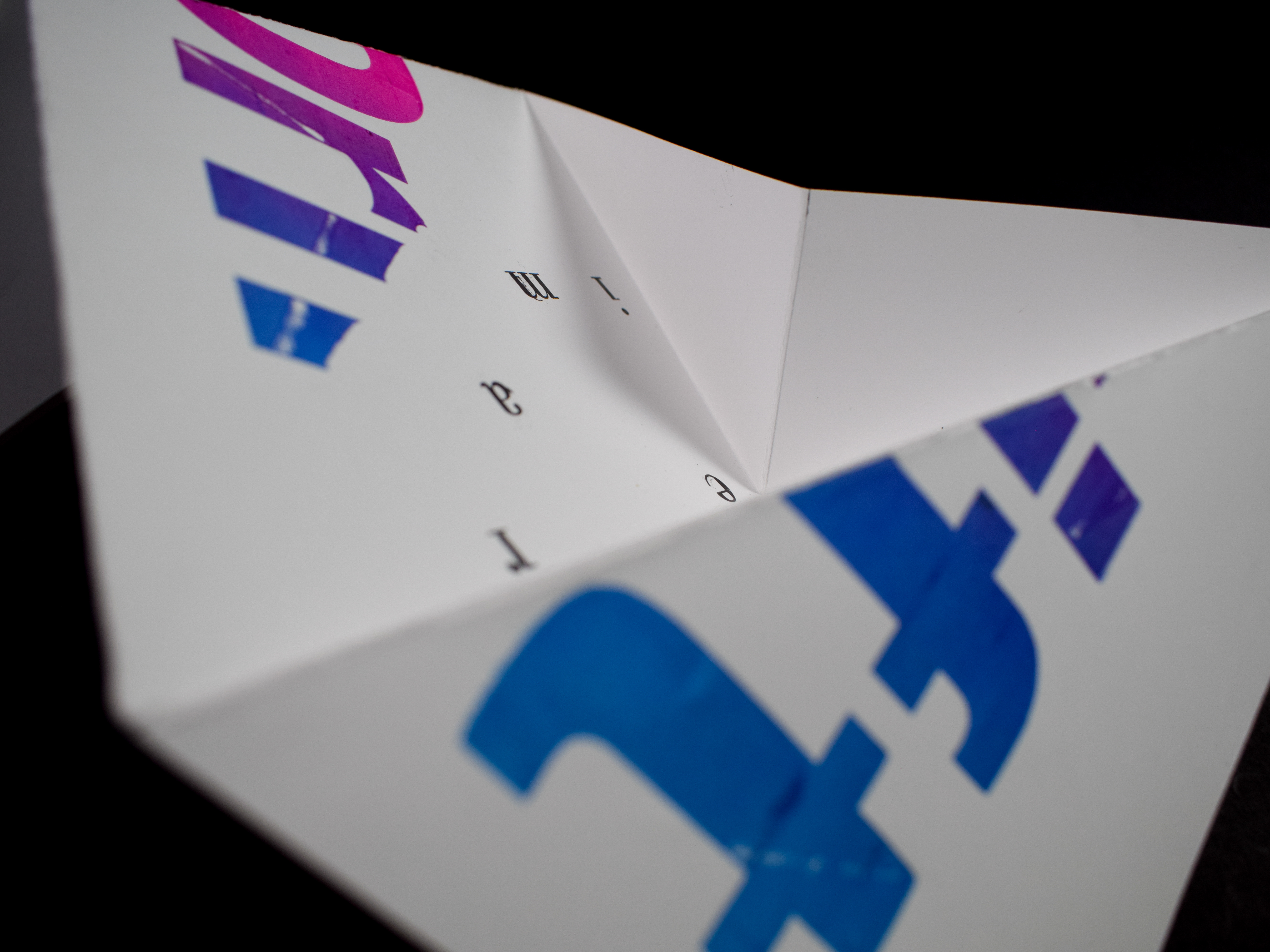
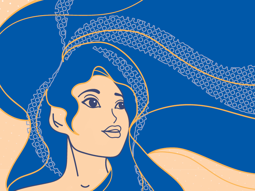
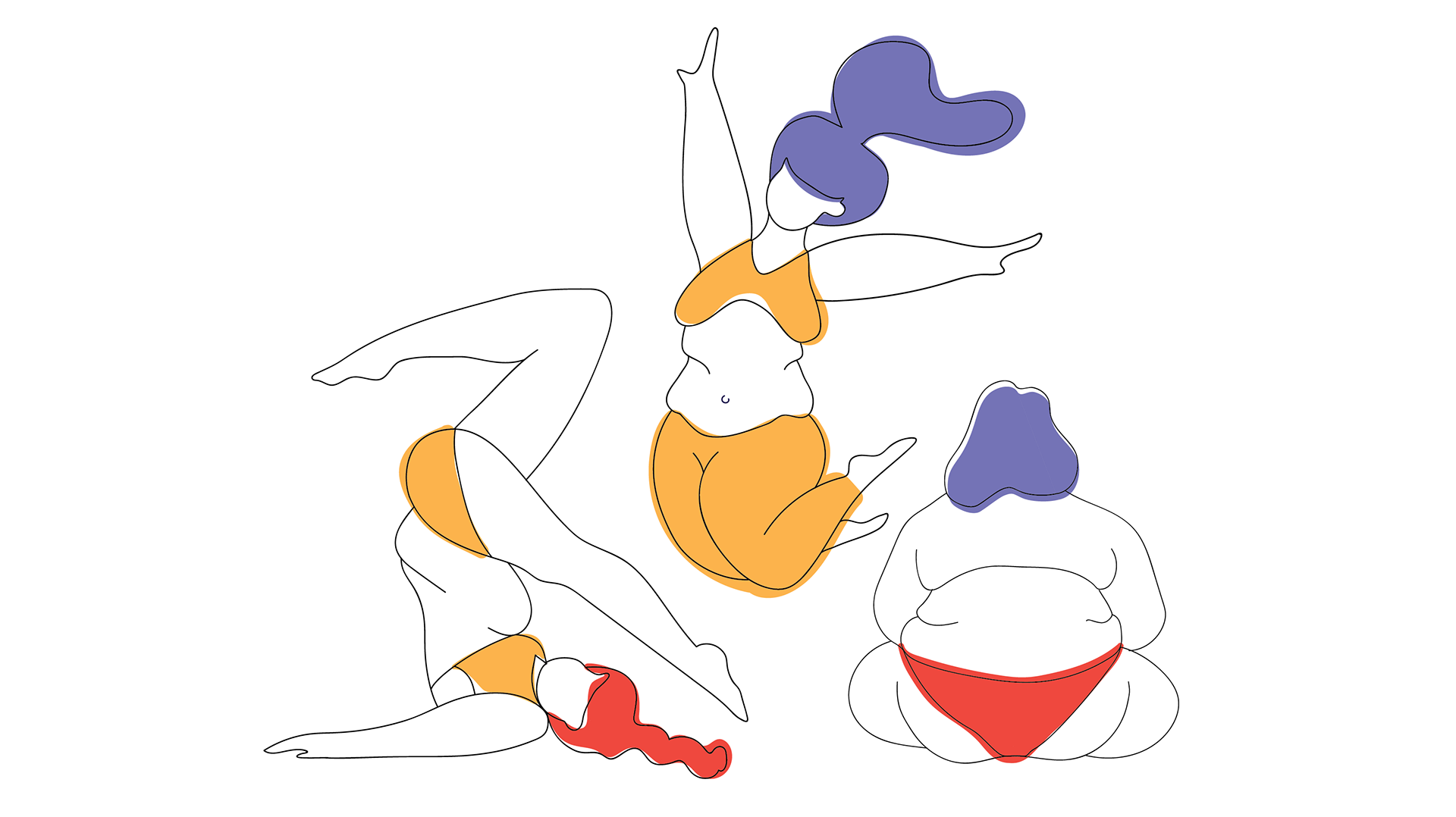
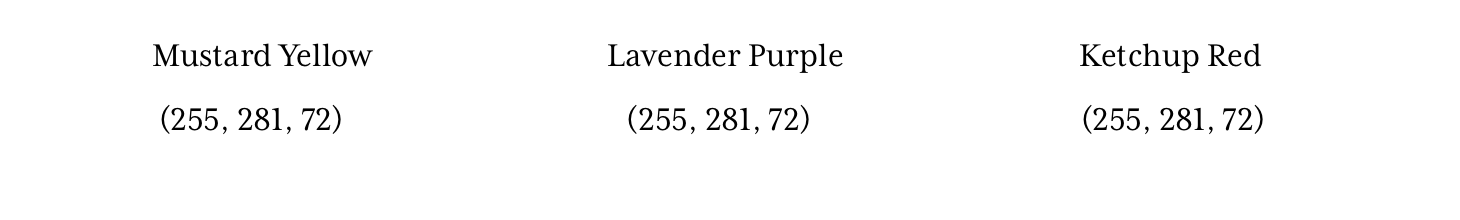
Since the goal of the redesign was to reflect the purpose of The Body Positive, it was important to introduce a unique style with a bright color palette. The challenge of this task was composing a visual aesthetic that met the redesign purposes and informational requirements. Hence, the redesign would take a modern approach with illustrations that would guide the viewer, paired with vintage filtered photographs to make the overall digital space timeless. The typefaces were chosen accordingly to compliment the illustrative style.
Color Palette

Typefaces


Headline – Neue Haas Grotesk Display Pro – 65 Medium
Body – Baskerville – Regular
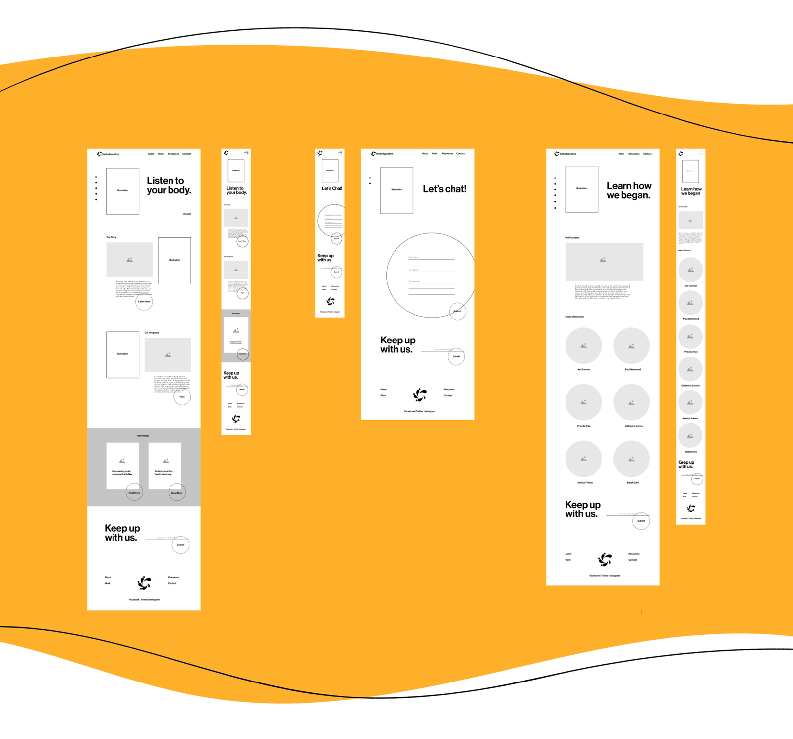
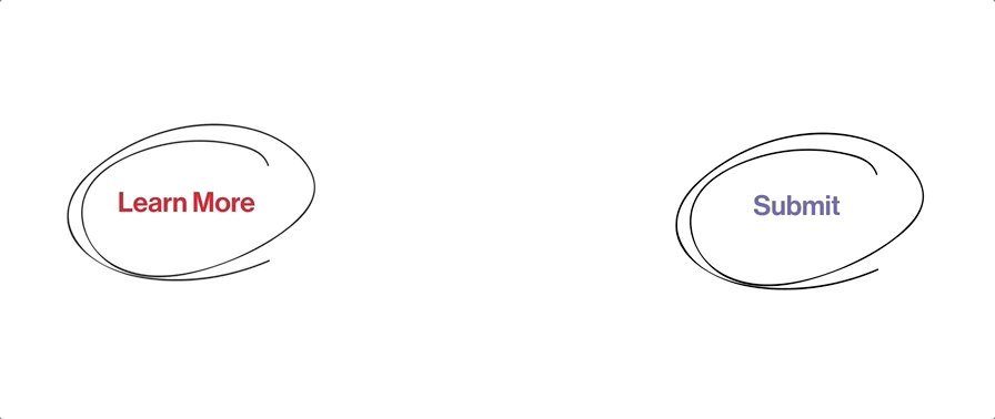
The redesign started with a site map, competitive analysis, wireframes, and mood board to derive the solution. Part of the process was making the digital space interactive by designing the buttons, hover states, and dividers using animated organic shapes.
Wireframes
Buttons
After a number of decisions between keeping the design creative and functional, the goal to reach the desired visual aesthetic was met! The final solution below presents the required information on the digital space in a creative and unique way that relates to the viewer and successfully reflects the purpose of The Body Positive .